Though healthtech is a cutting edge field, it markets to very conservative, clinical audiences who distrust heavily-designed, poppy marketing materials.
As a result, I led audience and UX research efforts to inform a brand platform redesign that cultivates a balance between the "health" and "tech" in healthtech.
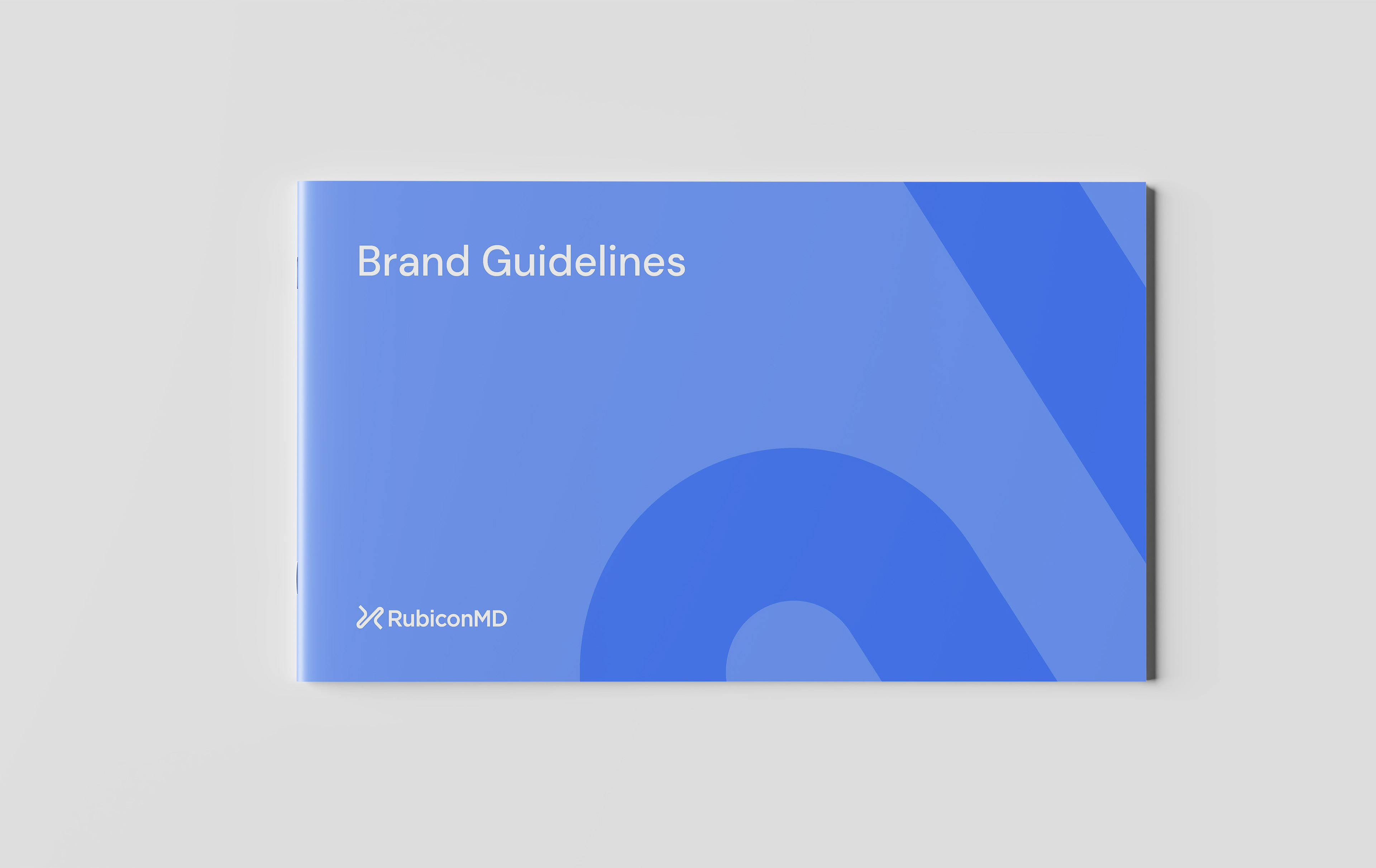
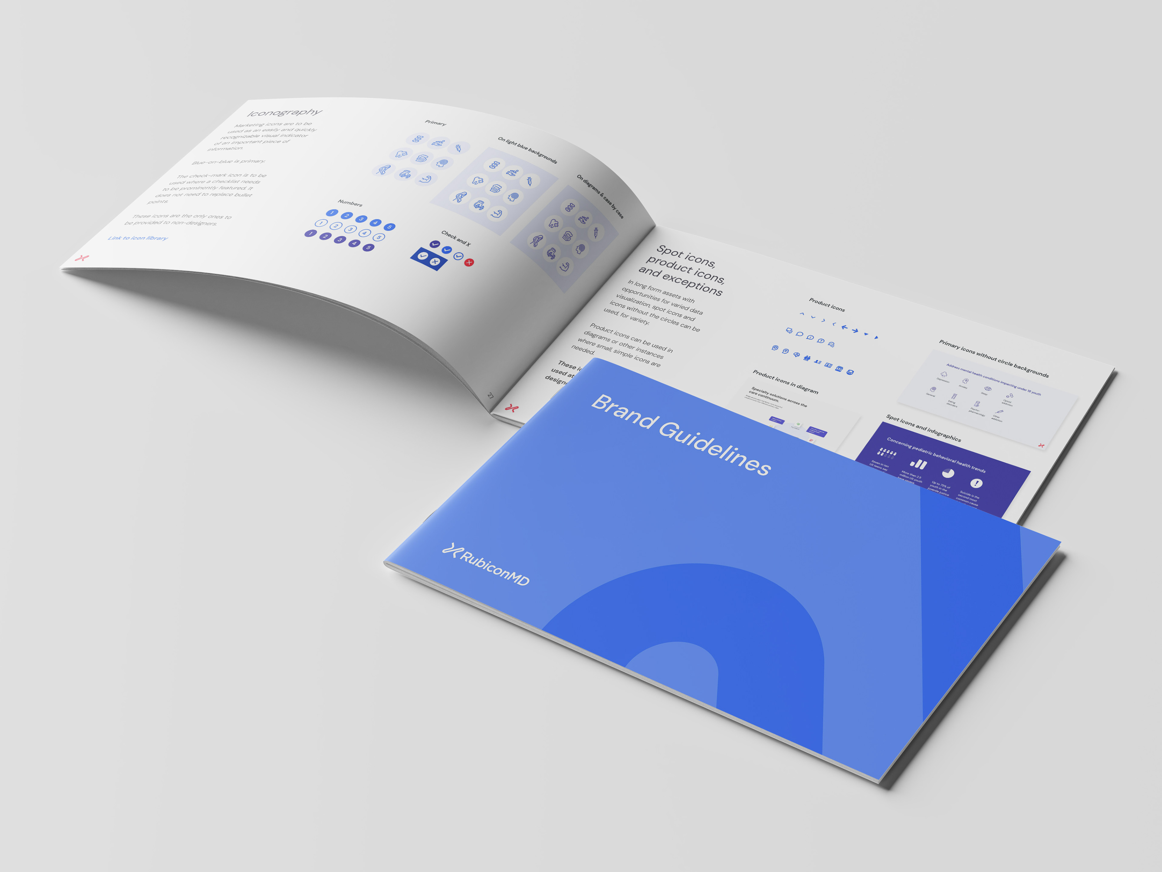
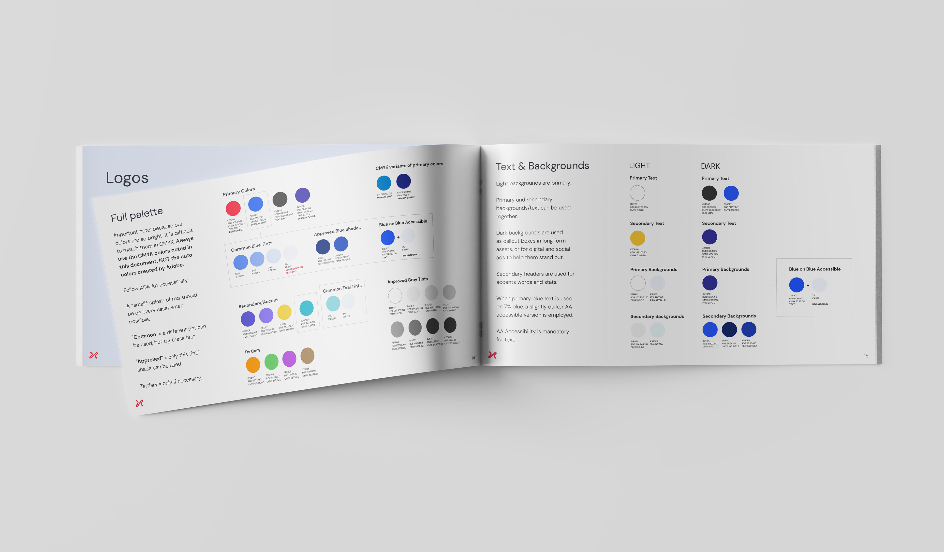
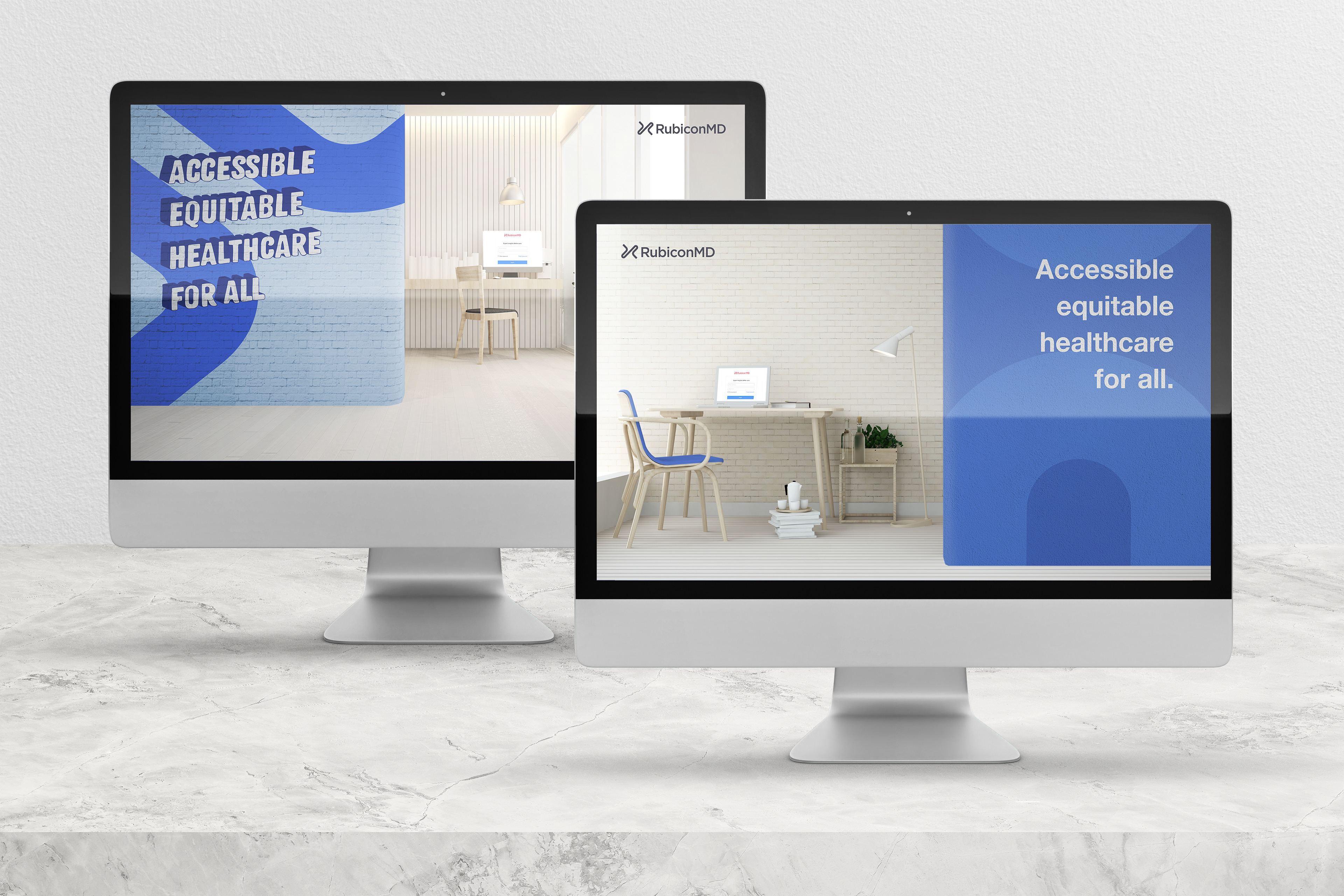
Based on our findings, I led a team to develop a new design system, brand guidelines, and website that helped drive a 30% increase in YOY inbound leads.
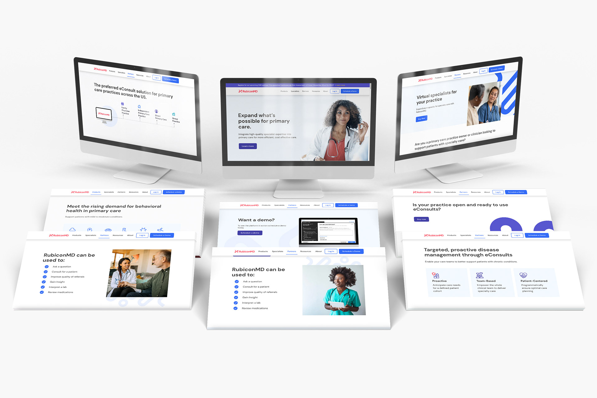
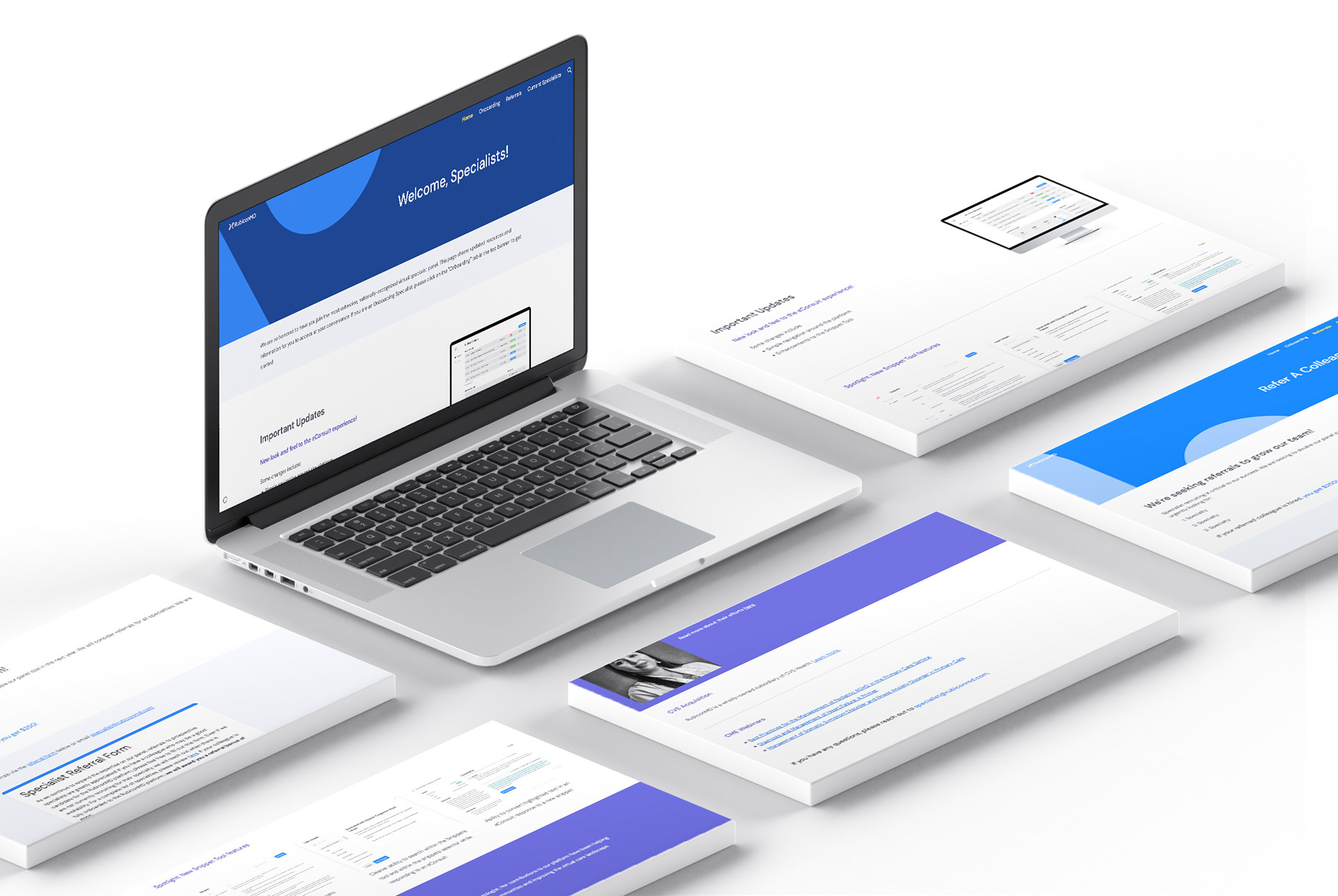
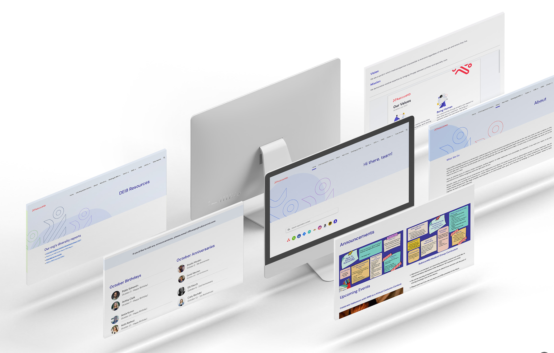
Here's the website (L), and an internal microsite for our clinician network (R)
Whereas our social and digital audiences were a little younger and we found ads strongest when they were bold-colored, modern, and provided easily accessed educational info.
I collaborated with the marketing team to craft copy that spoke directly to primary care providers, and complemented it with visuals
Targeted campaigns spanned paid media, web, email, social and live events and delivered 600% ROI on marketing spend.


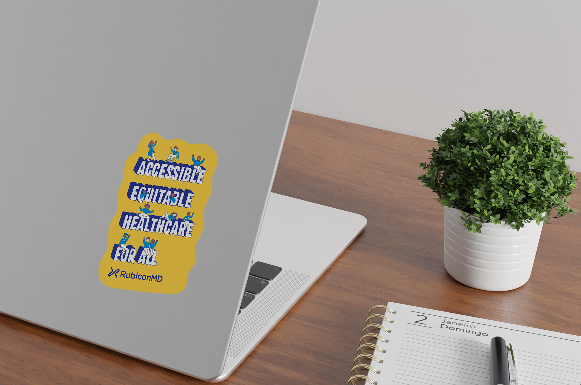
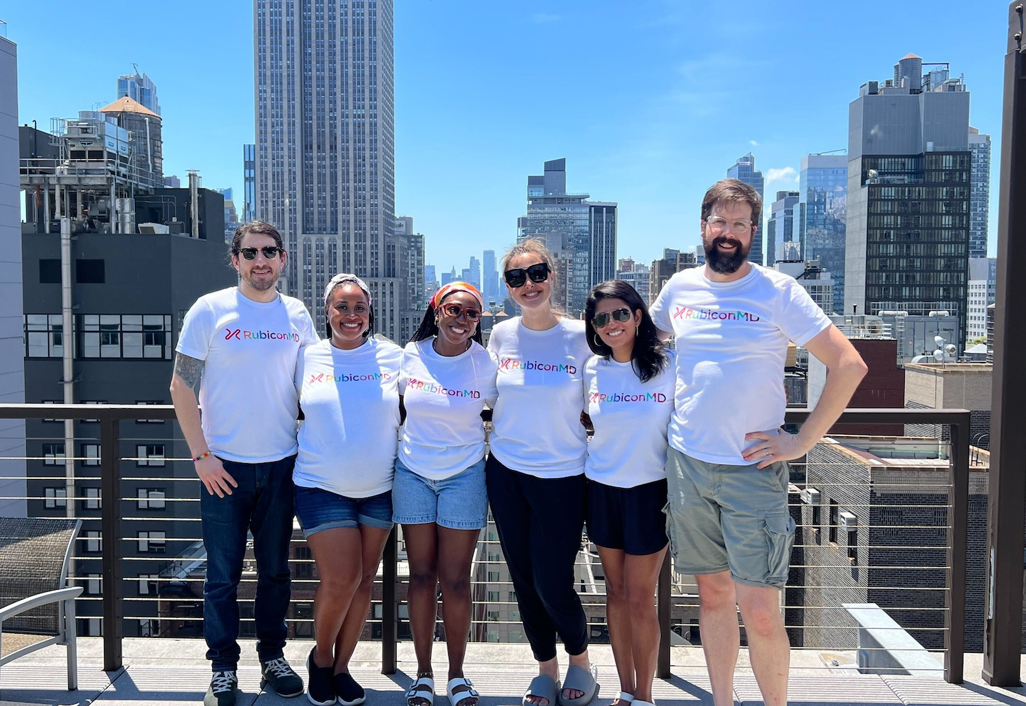
Meanwhile, a progressive tech company. RubiconMD's culture is important to them. I branded internal assets with a more progressive bend, playing with our colors, shapes, patterns and employing an illustrator to excite our tech-forward, progressive minded RubiconMD team.

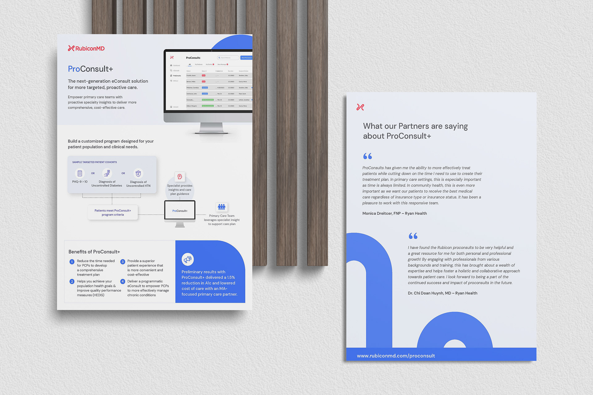
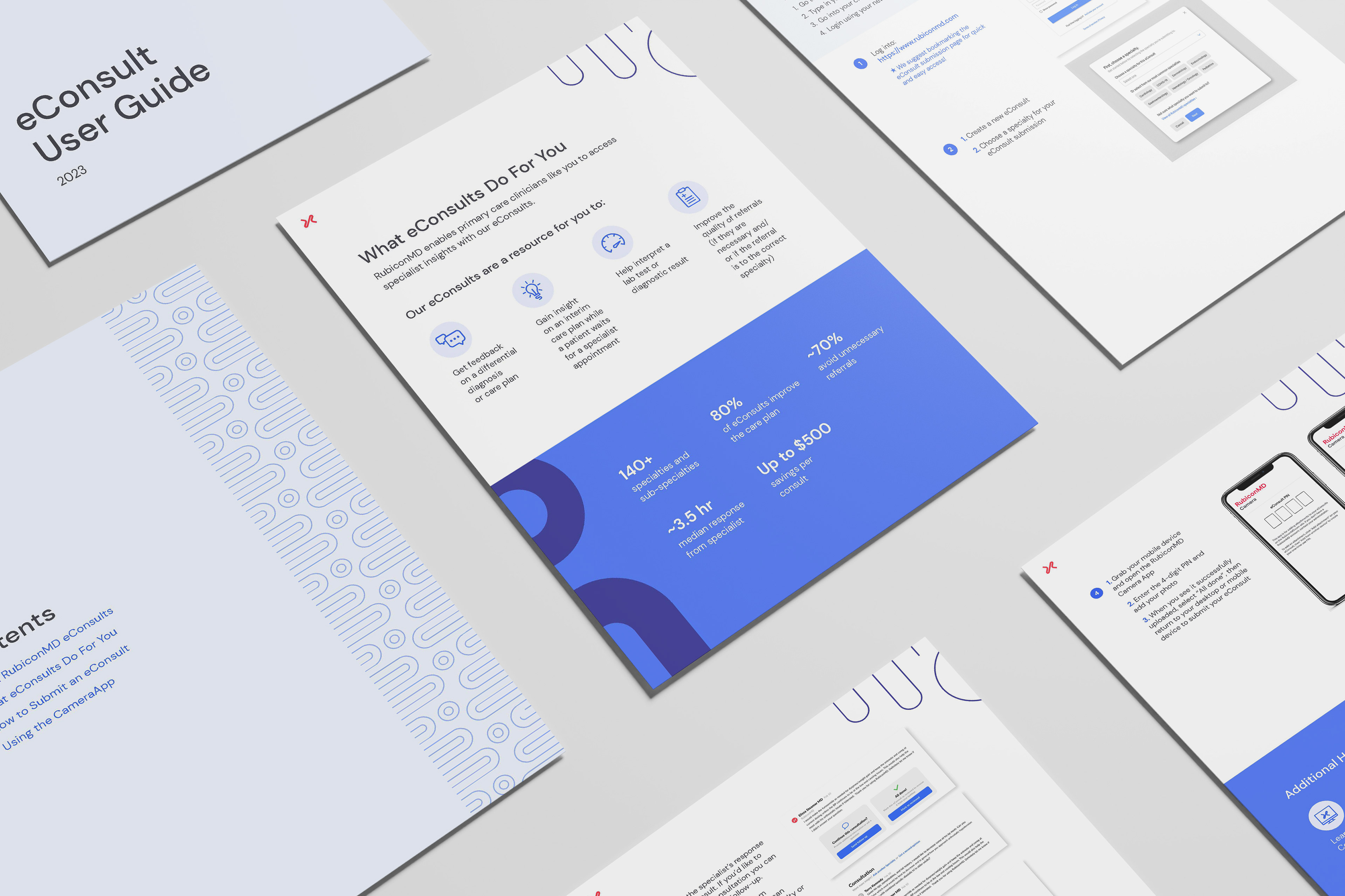
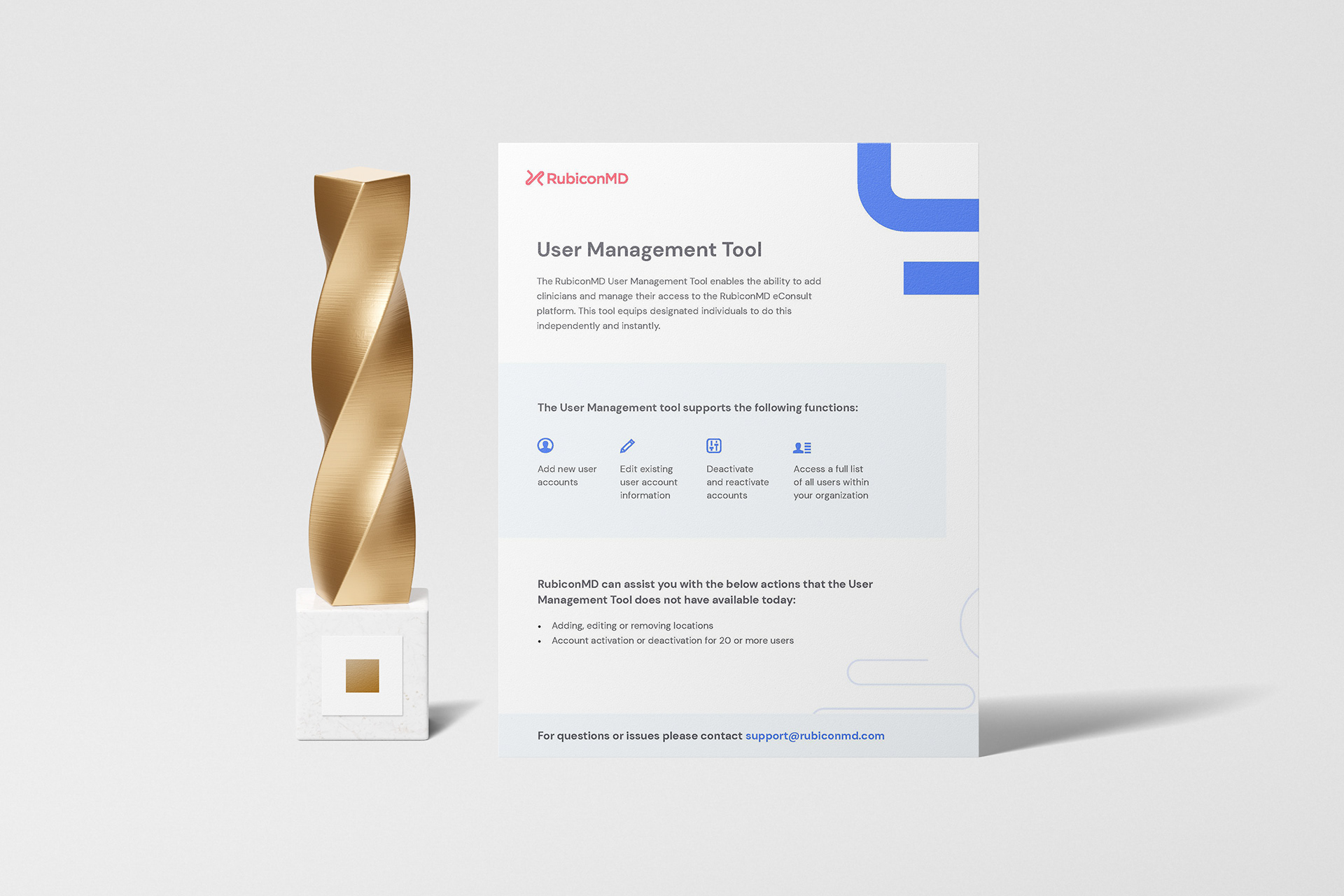
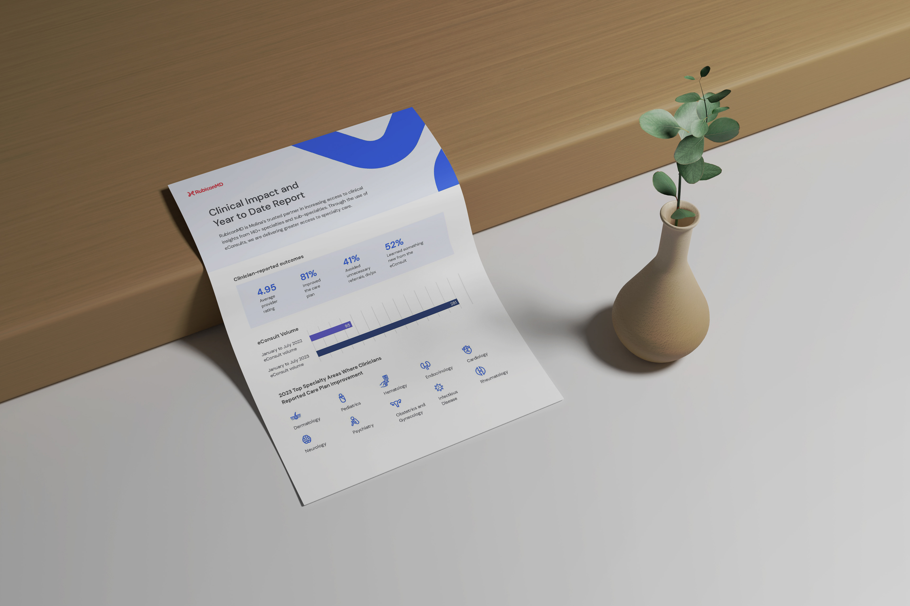
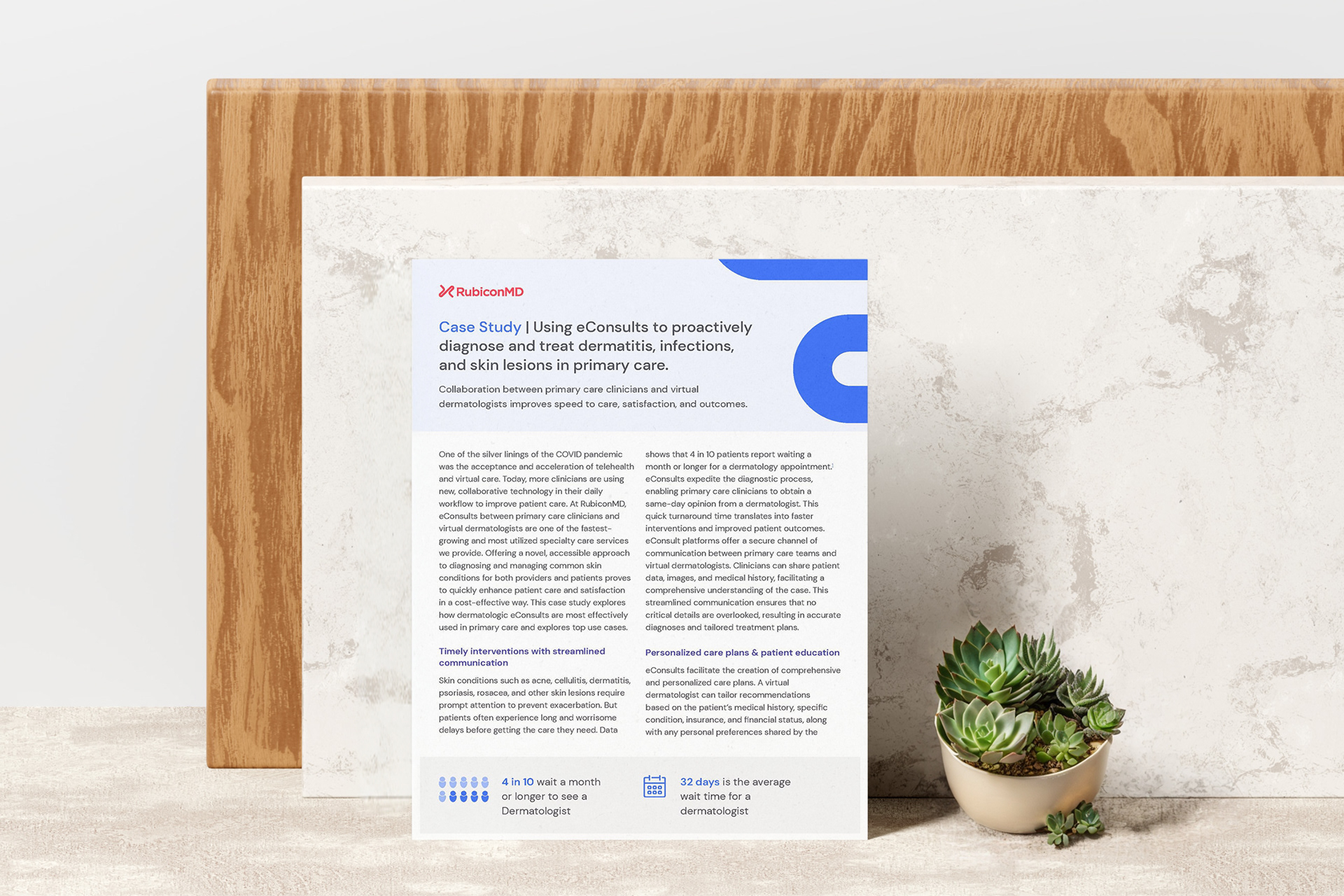
Digital case studies, white papers, and user guides embodied a progressive version the style of scientific abstracts, in order to be viewed as trustworthy.
Sticker illustration by Jeff Deng. The awesome contributing designers on my team were Kristen Mayer and Jeff Deng.
